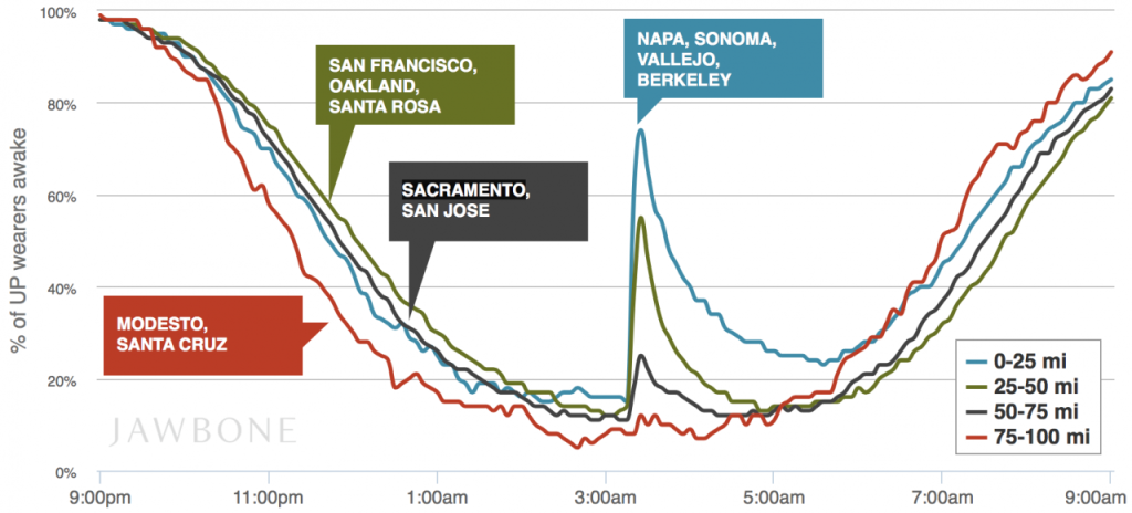
Jawbone has produced a chart that demonstrates that the closer you are to a magnitude 6.1 earthquake, the more likely you are to wake up and move:
Obvious, yes, but also interesting. First of all, it’s a cool illustration of the uses of aggregated data; Jawbone checked the sleep data collected by its UP wearers and saw these interesting patterns. Seventy-four percent of the wearers within 25 miles of Napa were awoken. The further away people were, the fewer woke up.
What strikes us, though, is that this chart was produced several hours after the fact — presumably as soon as it occurred to data scientist Brian Wilt to look for it. How soon was this data in Jawbone’s possession? Could they build (or have they built) a data center that proactively looks for anomalies within geographic areas? What interesting information could that tell people, and could it be of any interest to, say, Twitter?
