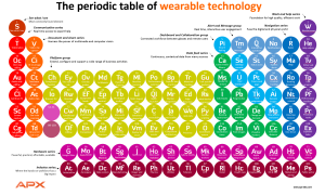
 APX Labs, which sells Skylight — software that connects wearable tech to enterprises — is out with a smart “periodic table” of the enterprise wearable ecosystem. It’s worth looking at because it gets so much right.
The chart’s focus is not on hardware or software, although those layers are certainly represented. Instead, it breaks down enterprise needs by function. Categories on the edges — communications on the left, and “work and help” on the right — are about “doing your work,” Ed English, APX’s chief product officer told WTI. “If the left-hand column is about connecting to people, the right-hand column is about connecting to work, getting your help and getting instructions.”
As functions and integrations get more complex and more reactive, they’re placed further to the center of the table and down. Because the chart is an analogy and not reality, there nothing here radioactive or unstable (at least, English said, not intentionally). But as a structure to hang thoughts about enterprise wearables, this is a really good starting place. Click to see larger.